Thursday, 3 April 2014

Group Feedback? Final (2) Perspective, Elevation, Section, Plan, Sketch

During the group feedback people pointed out to me that the background of my perspective, section and plan was too dark. They recommended to make the background as bright as my elevation "drawing". This was to show the contrast between the "colourful" outside and the "dark, black and white" inside. I was not too sure about that idea to be honest. I deliberately had left the background in a distinct colour palette for each image. I thought I would make the outside really colourful for the elevation to mirror the colours of my actual design. Images showing the inside would have a dark, cold background to describe the feeling of entering a room like that. Black words, white paper, etc. However, I gave my group's idea a try.

Furthermore, my group pointed something out that should be improved, too. My plan drawing was very confusing. I had realised that as well however had not come up with a good solution to change it yet. Someone suggested to use the image I was using as my sketch (painting) and incorporate a new image of my plan. The image I was using as a plan should be my new sketch. I thought this was a great idea.

Here are the results.


1: Plan (initial Sketch)

2: Section of 1, that shows the actual Plan drawing

3: Elevation

4: Perspective

5: Section

6: Sketch (initial plan)

I love it.


final (1) plan, elevation, perspective, section


At the moment, my elevation (image 1) and section (image 3) are in perspective as well as the actual perspective drawing (image 2). That is because I was experimenting which image I liked best as the perspective drawing. However I think I will rework my photoshop images to make the elevation (image 1) and the section (image 3) like they are supposed to be and go with my initial perspective drawing (image 2) as the perspective. 

Also, I think I will have to rework my Plan. I think it is a bit confusing the way it is right now....


1: Elevation

2: Perspective

3: Section

4: Plan


5: Sketch

Wednesday, 2 April 2014


Model in Cry Engine

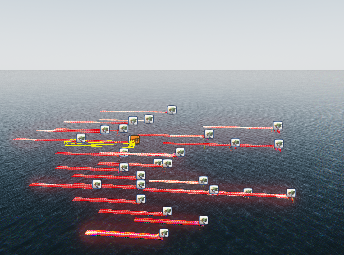
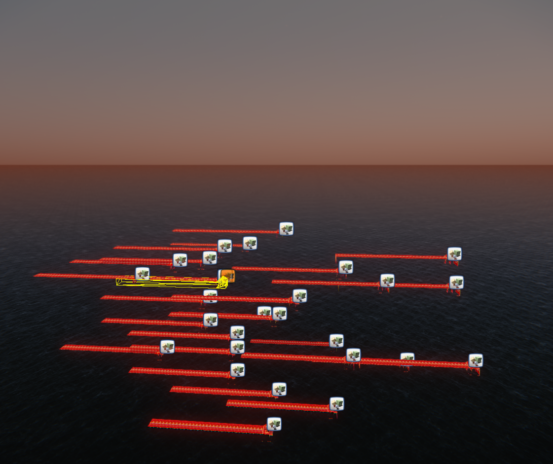
Unfortunately I could not manage to completely import my final Sketch up design. Some parts are missing. If I went back to Sketchup and changed it, it did not change it in Cry Engine as well. The extension of one wall was randomly extended, though. However I decided to play with my Design in Cry Engine by multiplying what had been imported. The result was quite interesting. I also enjoyed the time of day tool that allows you to apply different light effects and moods to your design. Here are my screenshots:


Sunday, 30 March 2014

Final Sketch up model


My final Sketch up model!
The elevation incorporates a multitude of textures. My grandma made me a patchwork blanket for my bed when I was about 9 years old. It is one of the most valuable things to me that I own. I took photographs of different fabrics she used and put them into my design. As I wanted to show variety I also went back to the boat sheds at the waterfront and took photographs of textures I could find there. I mainly used them for my walls and blue coloured areas.
For the outside of the side walls I used a photograph of the side of a book.
The inside is using the text that I posted previously. Experiences, Names, Stories, etc that are important to me are found on the higher parts of my boat shed (close to the roof) whereas least important things are located on a lower level.
The image on the floor of my boat shed is a print I did last year at an art school I attended. It was my first print and was very proud of it. I like how I have been using it for a multitude of things: wrapping paper, photo album covers, now in my boat shed. It adds to the mood of the room as a spacious mysterious place.


Examples of text I will be using

Those are some examples of hand-written and typed texts I will be using for the interior of my boat shed. I mixed handwritten and commuter typed texts to illustrate the relationship between the old and the new, the traditional and conventional.Some of the text is in English, some German and some Latin quotes. I used to learn Latin at school and my granddad who I was very close with used to adore the Latin language. Personally, I like how structured Latin is and am very interested in the Roman Empire which is discussed in the majority of texts we used to translate at school. Additionally, I like how Latin has that character of being old and wise.
Anyway, as I said some of my texts are hand written using different kinds of fond. I really value people taking time to write clean and nice and have always been very proud of my own handwriting. As I mentioned previously I also typed up text on the computer. I decided to print those texts on good quality paper and then photograph them again to emphasise the texture. This is one of the things I love about writing by hand - the feeling and smell of paper. Alright, I am getting too poetic now. Here are the images.


Most silent room in the world...WHAATT! Awesome video!

I cam across this video while doing some more research. I was fascinated. I would love to incorporate some of those ideas into my design however I feel I might not have enough time. Also, I guess it does not relate much to my final idea. However I thought this was definitely worth sharing, so interesting!

Wednesday, 26 March 2014

Continuing to figure out how to use Sketchup...

I felt like my initial Design on Sketchup (left)
using just basic colours to create the geometrical pattern was quite plain; it felt really flat to me.


However I decided to continue developing the idea by adding texture and patterns. Those are the experiments I have been doing:


I also decided to merge the "geometrical pattern" Design with the idea of using text. This is what I came up with:

Note: The texts used are images I retrieved from the Internet. If I continue developing this idea I will handwrite it myself describing personal experiences, memories, etc..


My findings of the process:

I like the idea of adding more texture, however I find the Design I got so far is too busy. I will try to think of a design that is between my initial and my current idea. Maybe I will use some wooden texture and some fabric patterns or similar.

I really enjoy the inside with the text. I like that it is capable of holding a lot of information and even though a lot if going on, I think it has a farm feeling to it. I would like to further develop it by using my own texts and handwriting as well as adding images from one of my previous sketches (see below). I will also consider things like different fonds for experiences of different importance as well as the location of the text - text on the floor representing foundation or more important things higher up, etc.